knitr::include_url("https://www.tidymodels.org/")Data visualisation basics
Statistical Analyses and data
Statistical analysis is the science of collecting, exploring and presenting large amounts of data to discover underlying patterns and trends
Warning
The theory of Statistical Analysis is NOT part of this course
Rather, it is to introduce you with the computational building blocks and example workflows you can build on to develop your own analysis.
The actual plots you create and statistical analyses you use will depend on the properties of the data and the questions you are trying to answer. For this, I recommend referring to many great books available on Statistics in R.
A great place to start is The Elements of Statistical Learning: Data Mining, Inference, and Prediction. by Hastie, Tibshirani & Friedman
while there are also many more on specialist topics like:
- Generalized Additive Models
- Mixed Effects Models and Extensions in Ecology with R
- Statistical Rethinking: A Bayesian Course with Examples in R and Stan
For a more practical introduction to statistical analysis in R, I recommend the Tidyverse for Beginners and Tidy Modeling with R
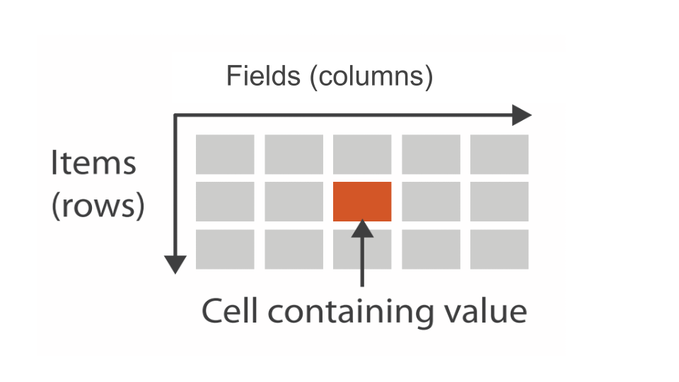
The foundation of any statistical analysis is DATA, most commonly, tabular data.
Data Visualisation: the visual encoding of data
Data Visualisation is the visual encoding and presentation of data to facilitate understanding.
Data properties guide visual encoding
The visual encoding we use is determined by the data and the relationships and statistical properties we want to convey.
You’ll find a handy guide at datavizcatalogue.com
Once we’ve chosen the appropriate plots, we need tools to construct them.
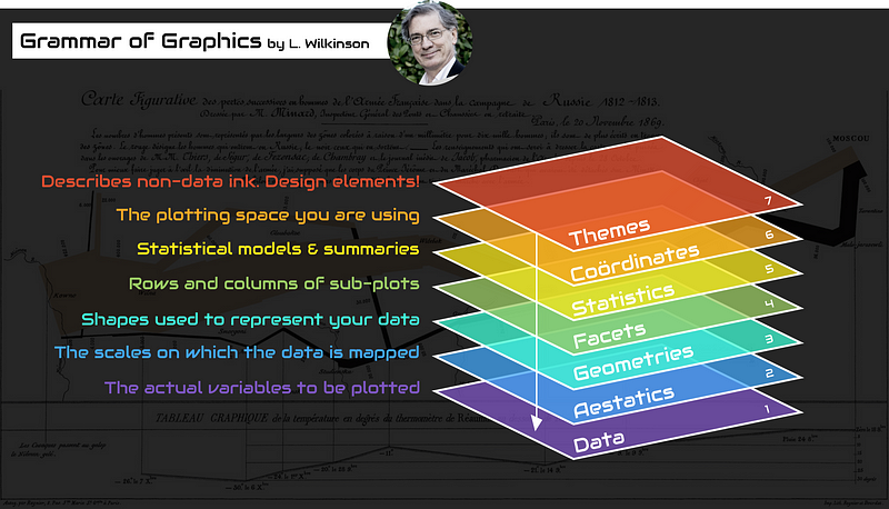
The grammar of graphics
An abstraction which makes thinking, reasoning and communicating graphics easier.
Developed by Leland Wilkinson, particularly in “The Grammar of Graphics” 1999/2005,
Describes a consistent syntax for the construction of a wide range of complex graphics by a concise description of their components.
Building a plot from its components
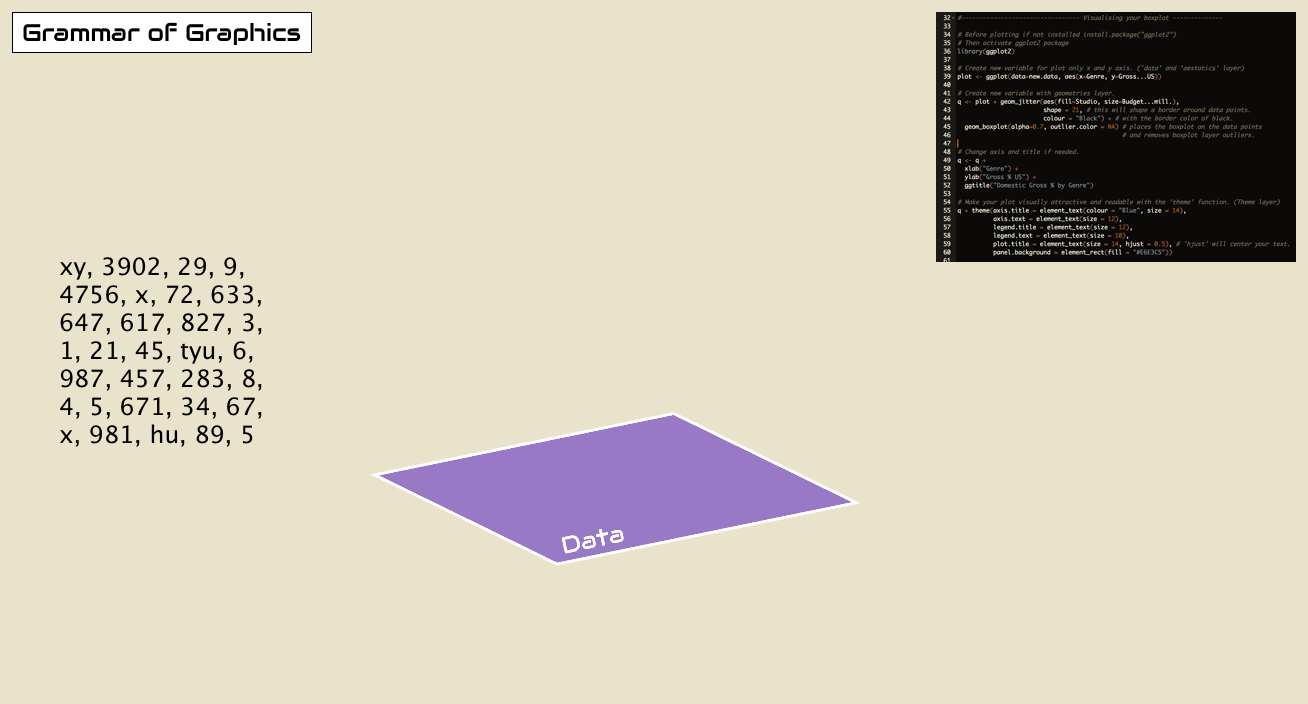
Start with some tabular data: mtcars
                     mpg cyl  disp  hp drat    wt  qsec vs am gear carb
Mazda RX4           21.0   6 160.0 110 3.90 2.620 16.46  0  1    4    4
Mazda RX4 Wag       21.0   6 160.0 110 3.90 2.875 17.02  0  1    4    4
Datsun 710          22.8   4 108.0  93 3.85 2.320 18.61  1  1    4    1
Hornet 4 Drive      21.4   6 258.0 110 3.08 3.215 19.44  1  0    3    1
Hornet Sportabout   18.7   8 360.0 175 3.15 3.440 17.02  0  0    3    2
Valiant             18.1   6 225.0 105 2.76 3.460 20.22  1  0    3    1
Duster 360          14.3   8 360.0 245 3.21 3.570 15.84  0  0    3    4
Merc 240D           24.4   4 146.7  62 3.69 3.190 20.00  1  0    4    2
Merc 230            22.8   4 140.8  95 3.92 3.150 22.90  1  0    4    2
Merc 280            19.2   6 167.6 123 3.92 3.440 18.30  1  0    4    4
Merc 280C           17.8   6 167.6 123 3.92 3.440 18.90  1  0    4    4
Merc 450SE          16.4   8 275.8 180 3.07 4.070 17.40  0  0    3    3
Merc 450SL          17.3   8 275.8 180 3.07 3.730 17.60  0  0    3    3
Merc 450SLC         15.2   8 275.8 180 3.07 3.780 18.00  0  0    3    3
Cadillac Fleetwood  10.4   8 472.0 205 2.93 5.250 17.98  0  0    3    4
Lincoln Continental 10.4   8 460.0 215 3.00 5.424 17.82  0  0    3    4
Chrysler Imperial   14.7   8 440.0 230 3.23 5.345 17.42  0  0    3    4
Fiat 128            32.4   4  78.7  66 4.08 2.200 19.47  1  1    4    1
Honda Civic         30.4   4  75.7  52 4.93 1.615 18.52  1  1    4    2
Toyota Corolla      33.9   4  71.1  65 4.22 1.835 19.90  1  1    4    1
Toyota Corona       21.5   4 120.1  97 3.70 2.465 20.01  1  0    3    1
Dodge Challenger    15.5   8 318.0 150 2.76 3.520 16.87  0  0    3    2
AMC Javelin         15.2   8 304.0 150 3.15 3.435 17.30  0  0    3    2
Camaro Z28          13.3   8 350.0 245 3.73 3.840 15.41  0  0    3    4
Pontiac Firebird    19.2   8 400.0 175 3.08 3.845 17.05  0  0    3    2
Fiat X1-9           27.3   4  79.0  66 4.08 1.935 18.90  1  1    4    1
Porsche 914-2       26.0   4 120.3  91 4.43 2.140 16.70  0  1    5    2
Lotus Europa        30.4   4  95.1 113 3.77 1.513 16.90  1  1    5    2
Ford Pantera L      15.8   8 351.0 264 4.22 3.170 14.50  0  1    5    4
Ferrari Dino        19.7   6 145.0 175 3.62 2.770 15.50  0  1    5    6
Maserati Bora       15.0   8 301.0 335 3.54 3.570 14.60  0  1    5    8
Volvo 142E          21.4   4 121.0 109 4.11 2.780 18.60  1  1    4    2
Encoding variables on axes
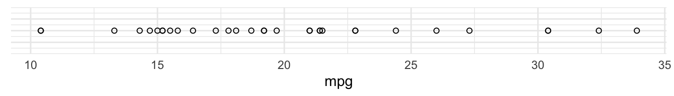
The first way we can visualise a single variable is to plot it on a single axis.
For example, here’s variable mpg (miles per gallon) plotted along a single axis:
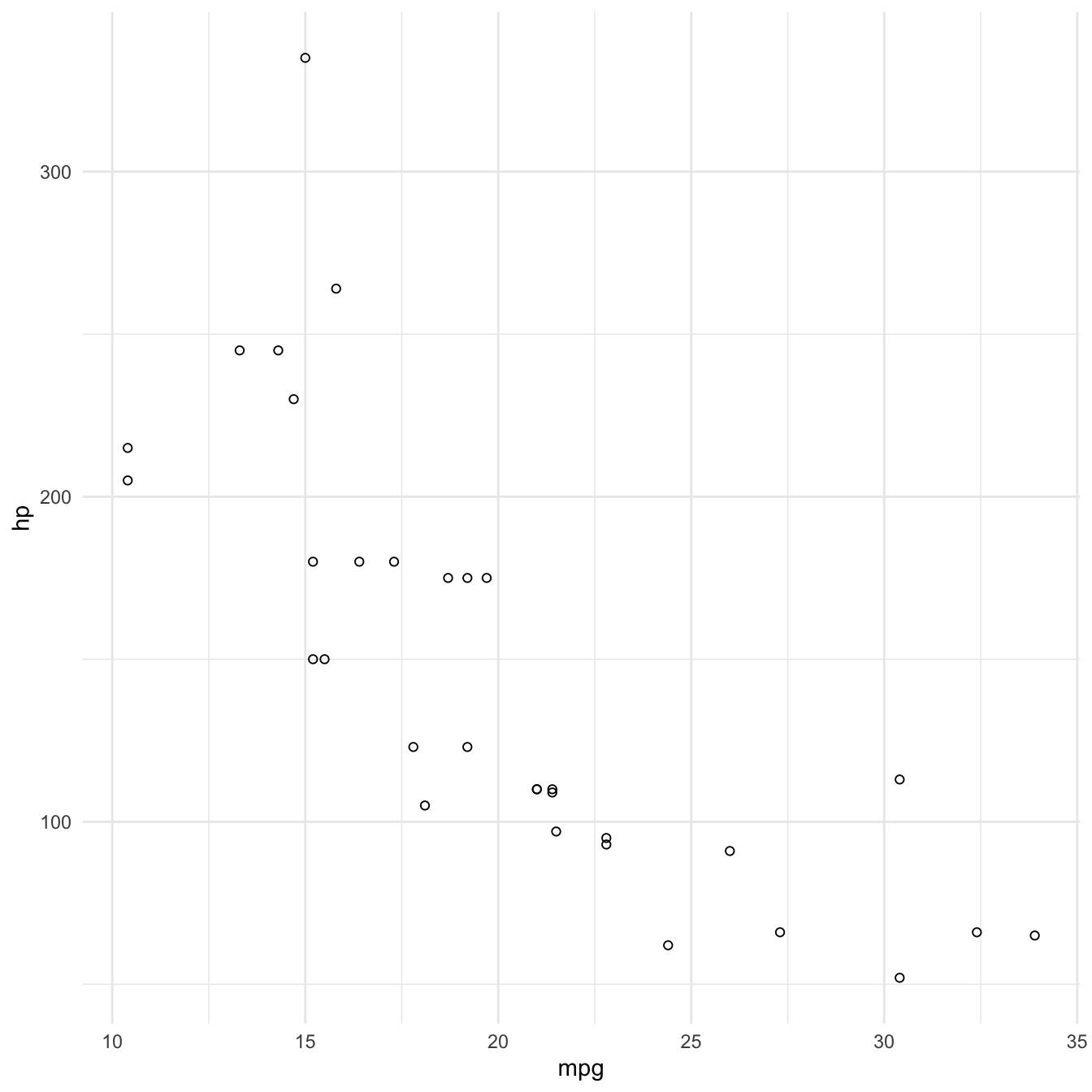
We could use the same way to visualise a second variable, hp (horsepower)

We can combine these two axes to visualise both the values of the data on each axis as well as the relationship of the two variables:
Encoding a third variable using colour
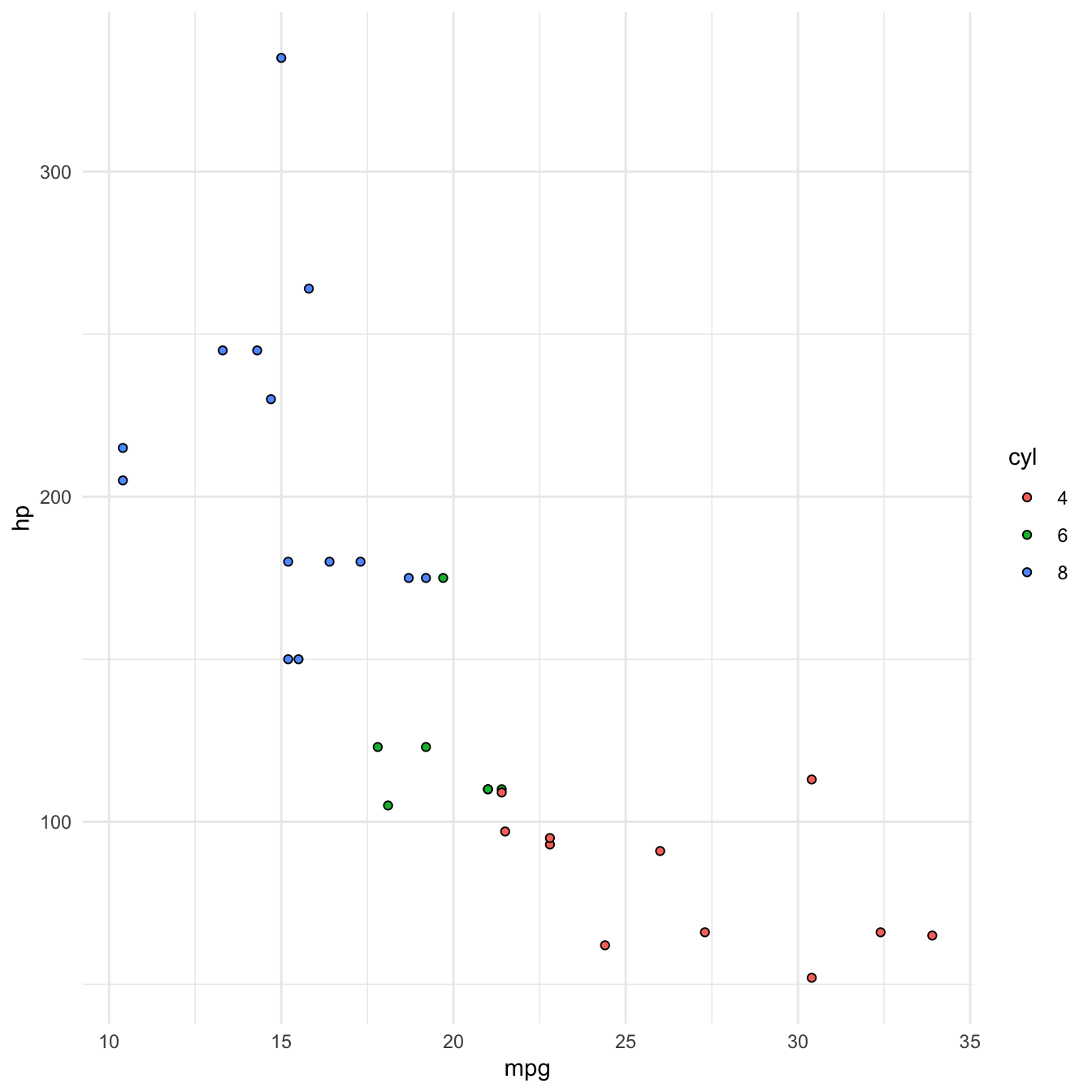
Now that we’ve used our two axes, we might want to consider another attribute to encode a third variable with.
We can use colour to encode cyl (number of cylinders).
Principles of good data encoding
Good visualization can bring out important aspects of data, but visualization can also be used to conceal or mislead.
- Consistency: The properties of the image (visual variables) should match the properties of the data.
- Importance Ordering: Encode the most important information in the most effective way.
- Expressiveness: Tell the truth and nothing but the truth (don’t lie, and don’t lie by omission)
- Effectiveness: Use encodings that people decode better (where better = faster and/or more accurate)