Data visualisation in practice
Exploring individual with ggplot2
Now let’s start putting some the tools and concepts we just learned to use with our data/individual.csv data.
Let’s say we are interested in exploring the relationship between individual plant stem_diameter and height.
Let’s also say that, from previous knowledge, we expect that the relationship may vary according to the growth_form.
So lets use data visualisation to explore the properties and relationships between the three variables.
Create analysis.R script
Let’s create a new .R script and save it as analysis.R in the root of our project.
Load packages & data
Let’s add some setup code to our analysis.R script.
Start by loading the ggplot2 as well as package dplyr so we have access to the pipe and other data munging functionality.
Let’s read in the data and also narrow it down to our variables of interest using the select() function.
Exploratory Data Analysis
Before we start exploring the relationship between variables, it’s important to understand the statistical properties of the underlying data. Statistical summaries such as the output of summary() are a good starting point.
summary(individual) stem_diameter height growth_form
Min. : 1.00 Min. : 0.30 Length:14961
1st Qu.: 11.60 1st Qu.: 5.30 Class :character
Median : 16.50 Median : 10.60 Mode :character
Mean : 20.21 Mean : 11.27
3rd Qu.: 26.30 3rd Qu.: 16.20
Max. :373.30 Max. :119.80
NA's :1346 NA's :1711 But data visualisation can be an even more powerful tool in expressing statistical properties of our data.
Distribution of data
To begin with, we can explore the properties of individual variables, starting with the distribution of values.
Let’s just work in our code attic/development.R script for now. We’ll transfer final plots to analysis.R when we are happy with them.
Distribution of stem_diameter
Lets start with stem_diameter which is a continuous variable. As such we can use geom_density to plot the distribution of the data.
individual %>%
ggplot(aes(x = stem_diameter)) +
geom_density()Warning: Removed 1346 rows containing non-finite outside the scale range
(`stat_density()`).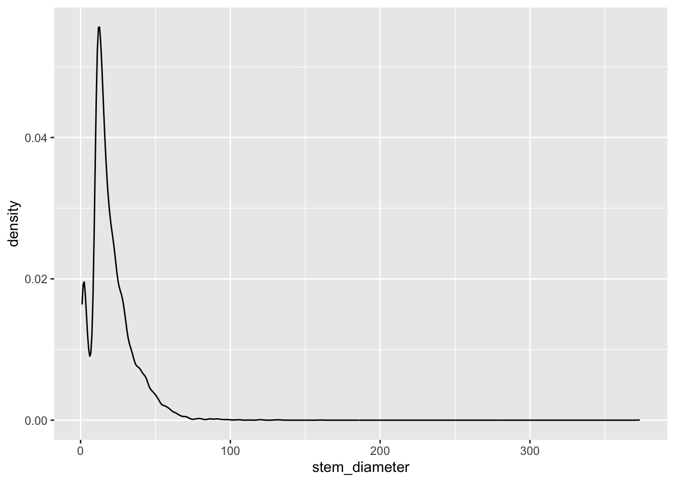
The distribution across all our data looks quite skewed towards lower values and a long tail of larger values and even shows a small dip in a certain range of stem_diameter.
Many statistical tests assume normality of the data and a common transformation to such skewed continuous data might be to log them.
ggplot allows us to perform such transformations during plotting and prints it as part of the variable axes label.
individual %>%
ggplot(aes(x = log(stem_diameter))) +
geom_density()Warning: Removed 1346 rows containing non-finite outside the scale range
(`stat_density()`).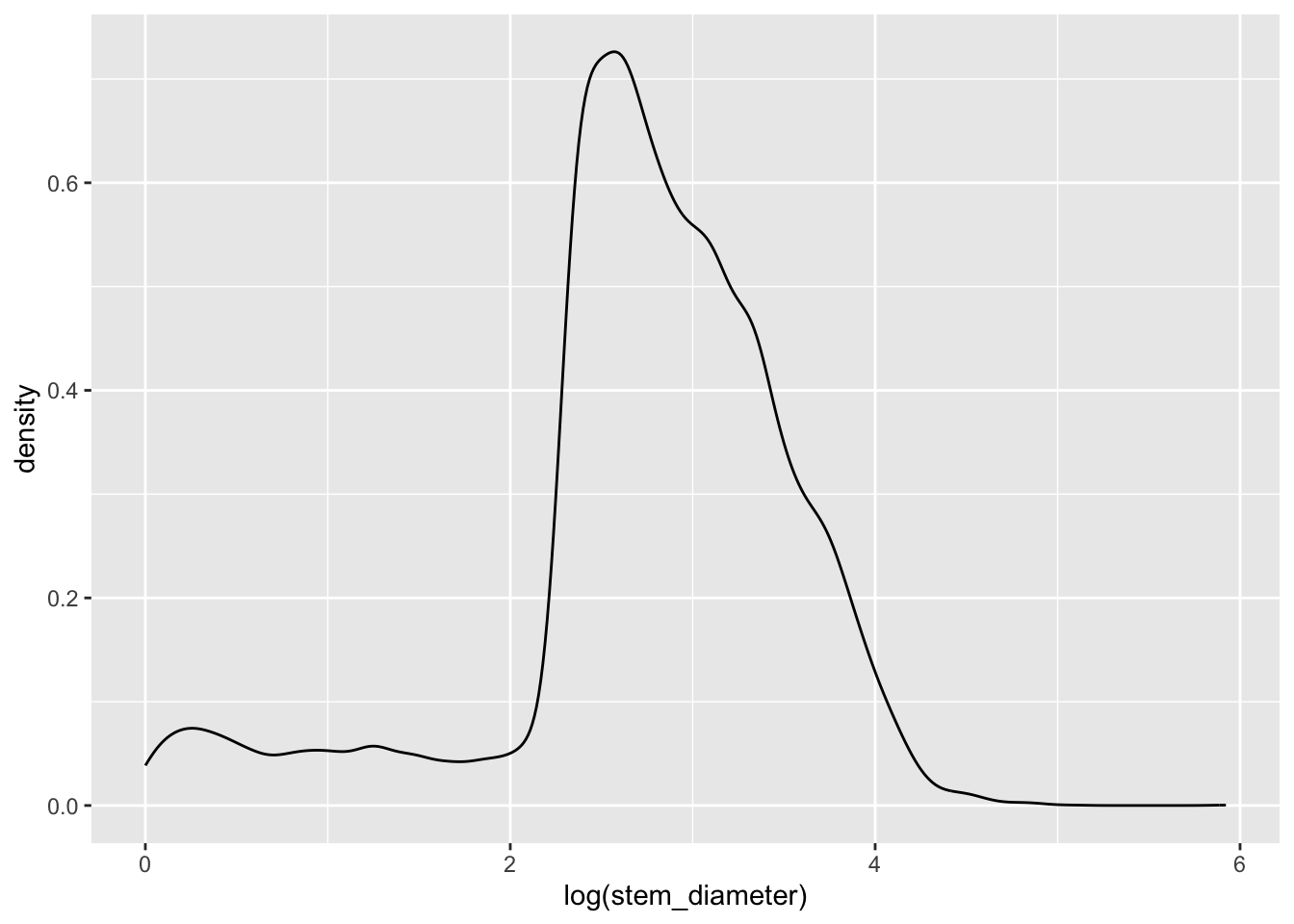
Still rather wonky and may well violate assumptions of statistical tests down the line but it is slightly better than before so just for demonstration purposes, let’s carry on presenting our data on a log scale.
Applying aesthetics to geometries
One thing that can make such plots visually more appealing is to fill in the area under the distribution curve.
This also gives us the opportunity to dig into what exactly the aesthetic mapping in aes() is doing.
Let’s say we wanted to fill in the area with the colour grey. Our first instinct might me to use aes() in ggplot() and map aesthetic fill to the name of the colour "grey".
individual %>%
ggplot(aes(x = log(stem_diameter), fill = "grey")) +
geom_density()Warning: Removed 1346 rows containing non-finite outside the scale range
(`stat_density()`).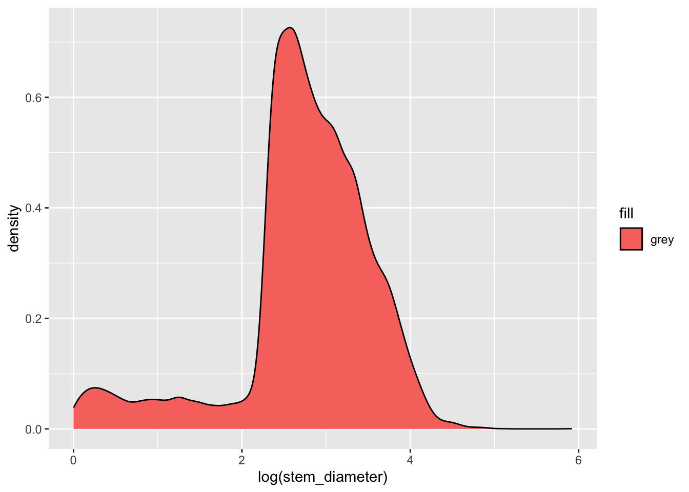
But this has unexpected results! This happens because we are supplying the colour name within aes(). aes() is for mapping variables to aesthetics and expects a variable name in our data or a vector of values.
Here we are giving it a single character value which it converts to a factor. It then uses it’s default function for creating categorical colour scales to assign the first colour in that scale (red) to our single factor level "grey". The important point here is that R is not interpreting "grey" as a colour, but as a categorical variable, as it did for factor(cyl).
To specify explicitly the fill colour of our density geom, we instead supply it as an argument to our geom_density() function, outside of aes(). Let’s change both the colour of the line and fill to "grey".
individual %>%
ggplot(aes(x = log(stem_diameter))) +
geom_density(colour = "grey", fill = "grey")Warning: Removed 1346 rows containing non-finite outside the scale range
(`stat_density()`).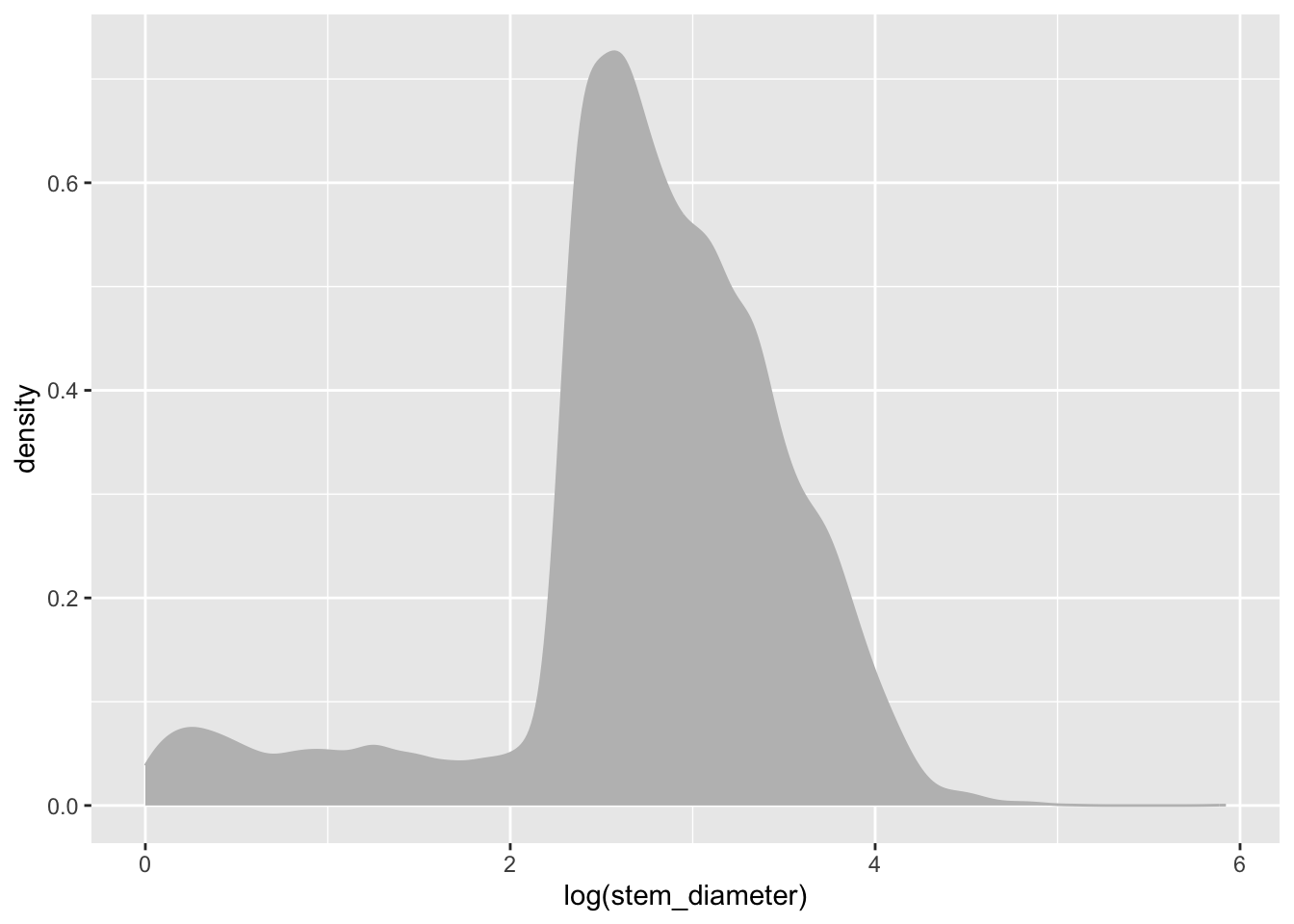
Distribution of height
We can similarly create a density plot for height
individual %>%
ggplot(aes(x = height)) +
geom_density(colour = "grey", fill = "grey")Warning: Removed 1711 rows containing non-finite outside the scale range
(`stat_density()`).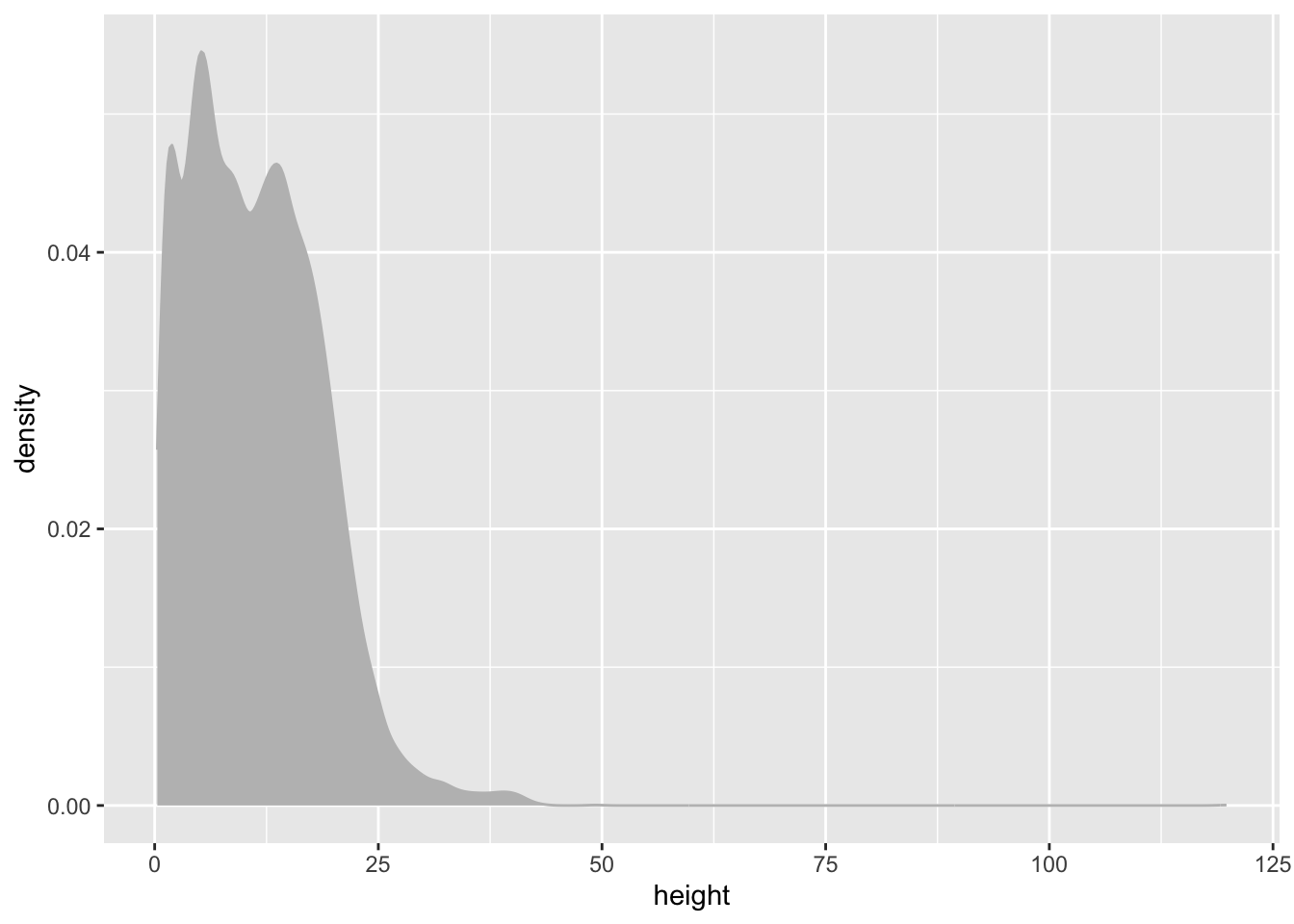
It’s also a bit skewed so lets go ahead and work with log() values again.
individual %>%
ggplot(aes(x = log(height))) +
geom_density(colour = "grey", fill = "grey")Warning: Removed 1711 rows containing non-finite outside the scale range
(`stat_density()`).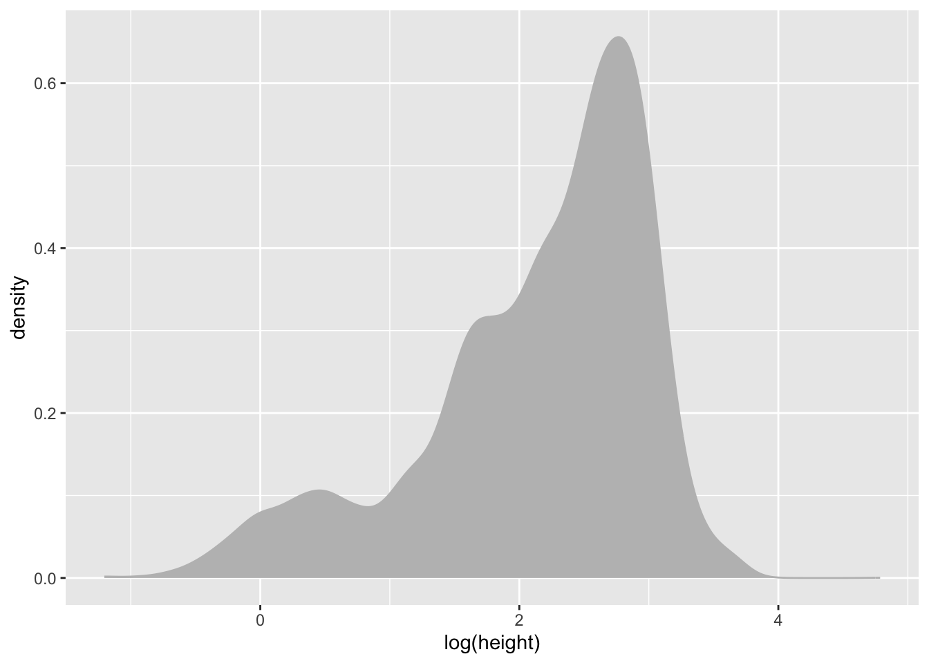
Distribution of growth_form
In contrast to stem_diameter and height, growth_form is a categorical variable.
As such, we use geom_bar() to plot a bar plot of the counts of values of each growth_form in our data.
A bar plot plots categorical data across one axes and numeric data (in this case counts) on the other axis.
Let’s also map colour aesthetics to growth form.
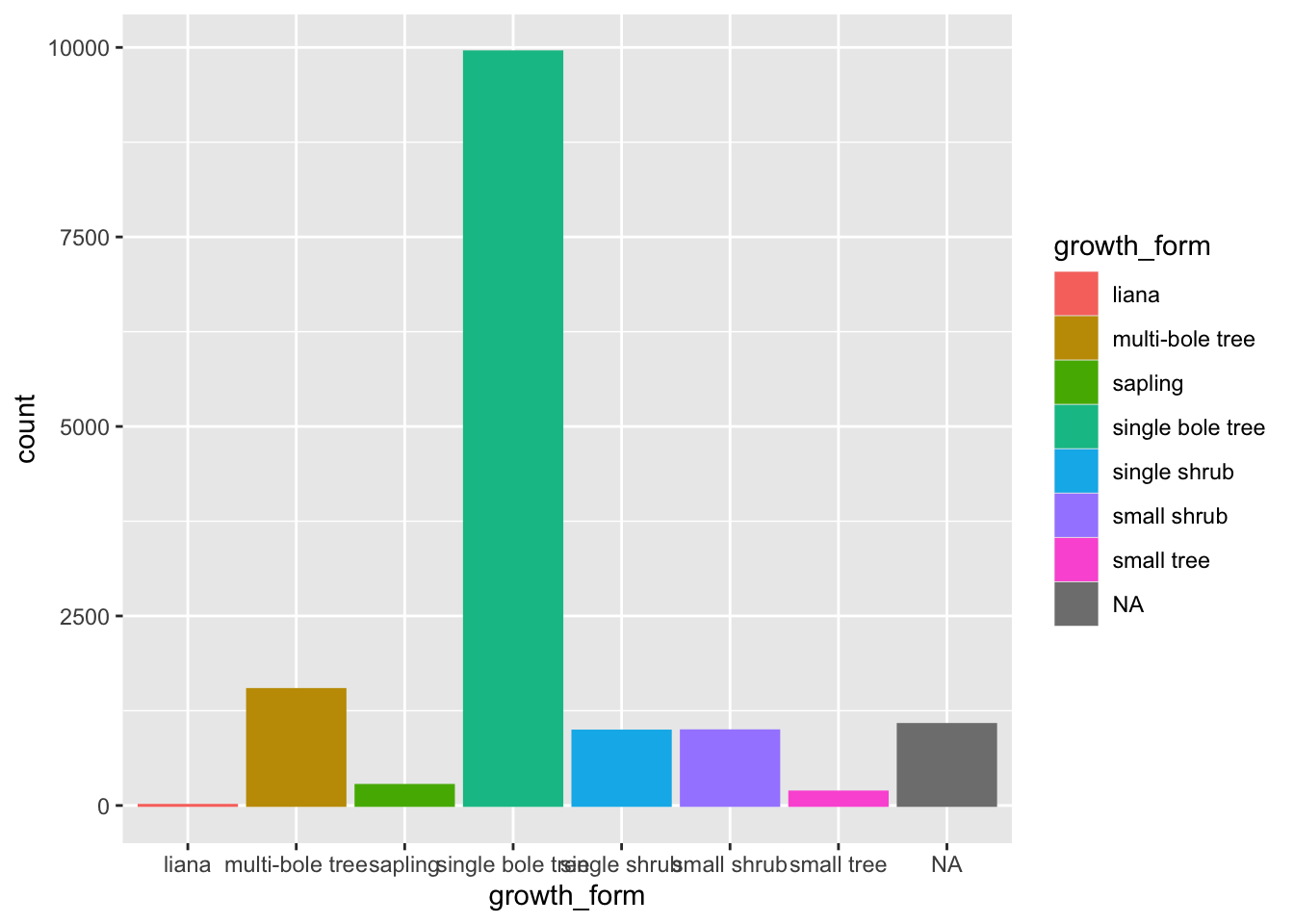
We can see that there are very few entries for "liana".
There are also a whole bunch of NAs in growth_form. Indeed for our analysis, we’ll need values for all three columns, what we call complete cases.
So let’s filter our data to: - remove any rows where growth form is "liana". - **retain only complete cases, i.e. rows where no NAs exist in any columns.
To do this, we’ll use dplyr::filter() and introduce a new function, complete.cases() which takes a data.frame, (which is why we pass the entire data object with .) and returns a logical vector with TRUE for rows with complete cases and FALSE for rows with incomplete cases.
Let’s assign this new data to a new analysis_df and work with that from now on.
analysis_df <- individual %>%
filter(complete.cases(.), growth_form != "liana")💾 Let’s move those data preparation steps to analysis.R
Ordering bars in a bar plot
Let’s also order our bars in order of ascending counts. The simplest way to do this is to convert growth_form to a factor and specify the ordering of the factor levels.
To do that let’s create a vector of growth_form unique values, ordered according to their counts in the raw data.
We can do this by using table to get the counts, order to order them in ascending order and names to extract the names!
We can then specify the level order when we mutate growth_form to a factor using gf_levels through argument levels in factor.
💾 Let’s move those data preparation steps to analysis.R
Let’s have a look at our bar plot now:
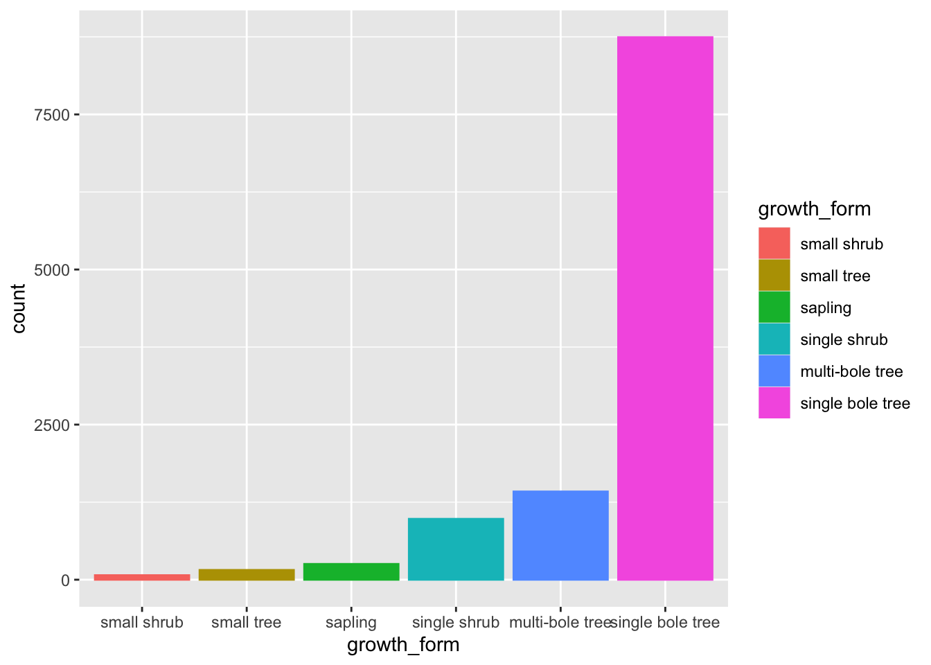
The order of the levels in growth_form now dictates the order in which the bars are plotted!
Swapping axes in a bar plot
Finally, let’s just add a few extra touches to make the plot even more visually clear.
Let’s flip the axis by mapping growth_form to y, that prevents growth_form axes labels from overlapping.
Let’s also remove the superfluous legend and reduce the opacity of our bars so we can see the scales through them
analysis_df %>%
ggplot(aes(y = growth_form, colour = growth_form, fill = growth_form)) +
geom_bar(alpha = 0.5, show.legend = FALSE)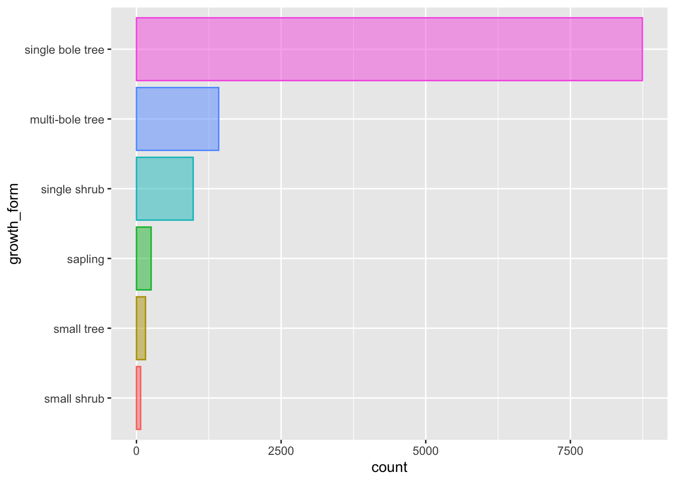
That’s better.
💾 Let’s keep this plot and move it to our analysis.R script as fig 1.
Plotting multiple densities according to the values of a second variable
When plotting the density distributions we ended up having one plot per variable with little understanding of how values where distributed across the various growth forms.
However, ggplot and the grammar of graphics allows us to build more informative plots, by combining the information in categorical variables to present cross variable distributions.
Let’s explore what this means by focusing on the distribution of stem_diameter across the growth_form categories in our development.R.
We can plot out a separate density curve for each growth form by mapping categorical variable grow_form to aes() argument group.
analysis_df %>%
ggplot(aes(x = log(stem_diameter), group = growth_form)) +
geom_density()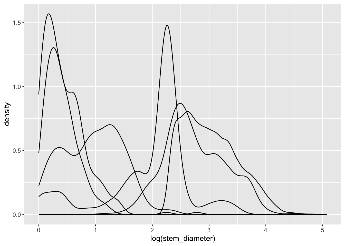
Now we have separate distribution curves for each growth_form!
This first pass is not however visually easy to interpret. Let’s assign growth_form to some additional aesthetics to make the visual encoding clearer.
We can in fact get rid of the group argument and use fill and colour instead. The grouping behaviour is equivalent.
analysis_df %>%
ggplot(aes(x = log(stem_diameter), colour = growth_form, fill = growth_form)) +
geom_density()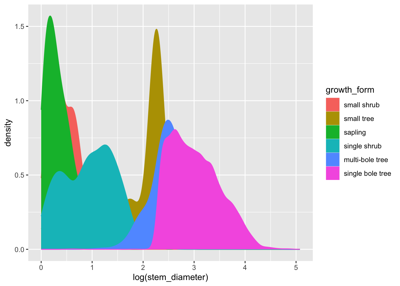
To make things even clearer we can supply additional argument to geom_density.
Let’s decrease the opacity of each density geom and trim it to the ranges of values across each growth_form.
analysis_df %>%
ggplot(aes(x = log(stem_diameter), colour = growth_form, fill = growth_form)) +
geom_density(alpha = 0.5, trim = TRUE)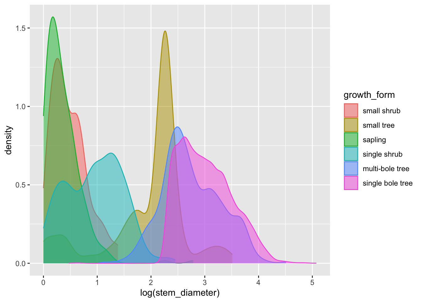
That’s a lot clearer, and now we can see that overall the distribution of log(stem_diameter) across growth forms follows a broadly bimodal distribution. However, the distributions across each growth formal appear more normal.
To allow us to focus more on the individual distributions, we can use facet_wrap() and formula ~growth_form to create individual panels for each growth form on a grid:
analysis_df %>%
ggplot(aes(x = log(stem_diameter), colour = growth_form, fill = growth_form)) +
geom_density(alpha = 0.5, trim = TRUE) +
facet_wrap(~growth_form)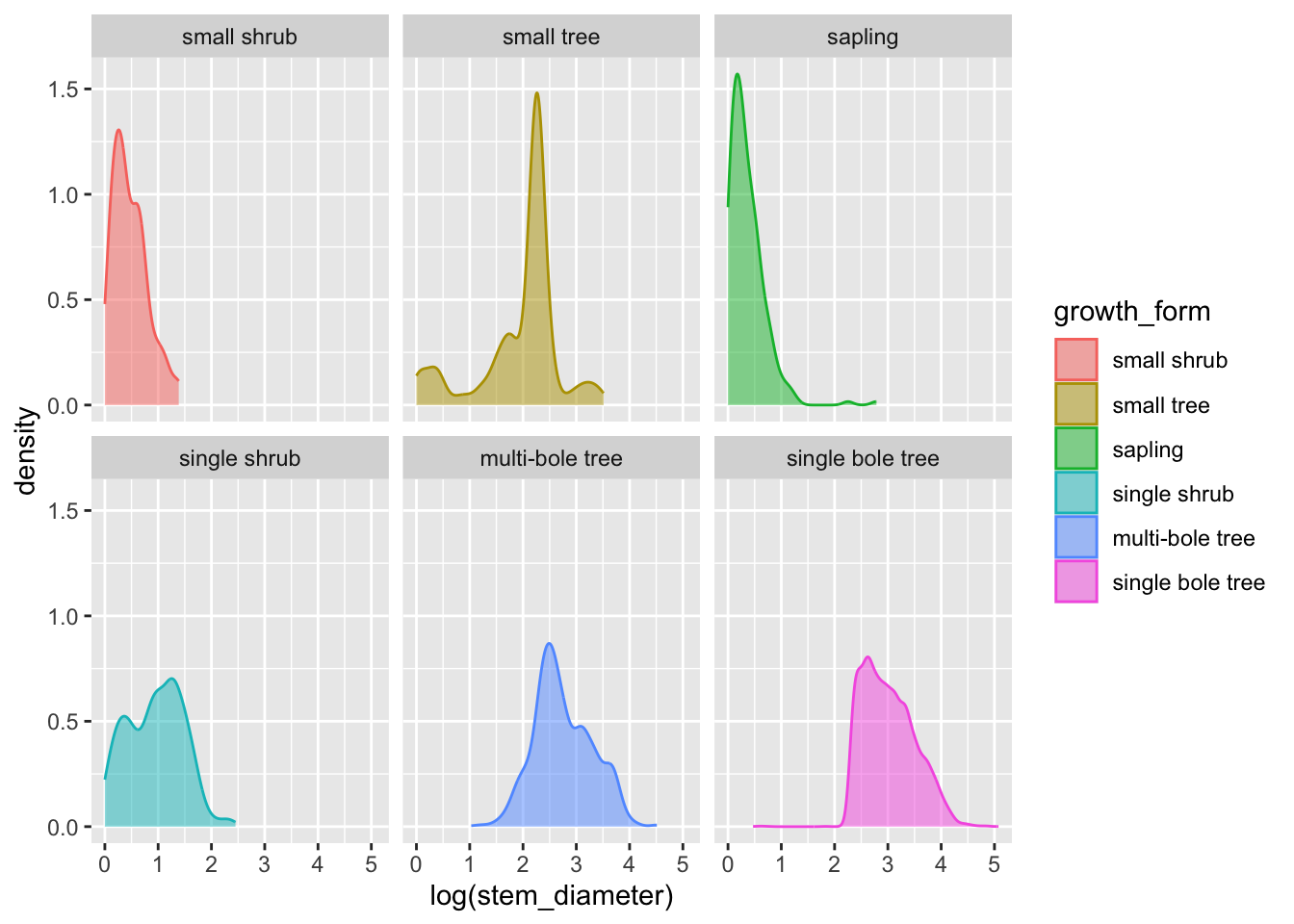
Encoding multiple distributions with violin plots
Another way we can present the distribution of a continuous variable in a compact way and grouped according to the value of a categorical variable is to use a violin plot.
Let’s straight away add some colour aesthetics also.
analysis_df %>%
ggplot(aes(x = log(stem_diameter), y = growth_form,
colour = growth_form, fill = growth_form)) +
geom_violin(alpha = 0.5, trim = T)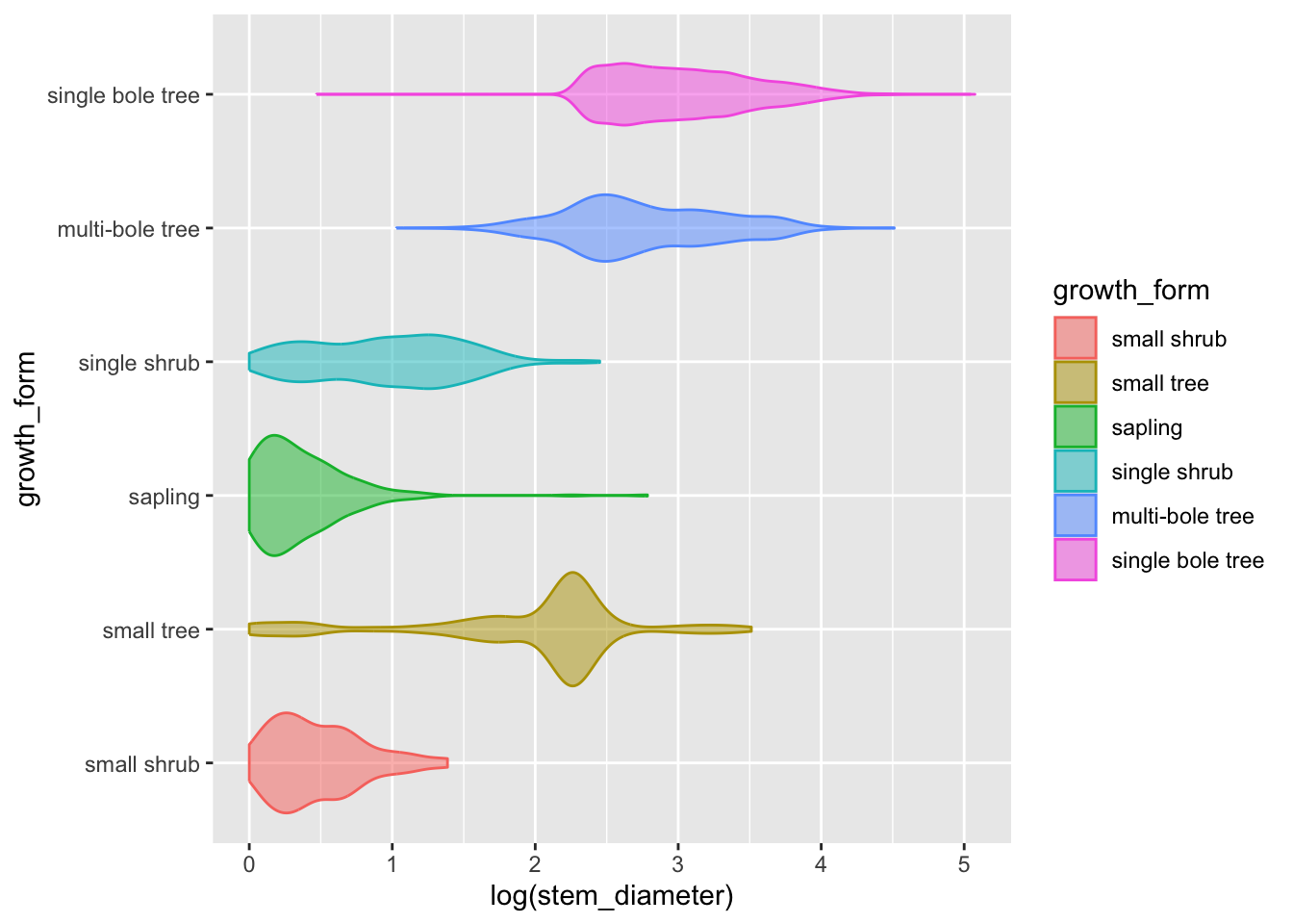
Adding statistical summaries with geom_boxplot()
We can go a step further and add statistical information about our variable by overlaying a boxplot (or box and whiskers plot). The boxplot compactly displays the distribution of a continuous variable by visualising five key summary statistics (the median, two hinges and two whiskers), and all “outlying” points individually.
Let’s also suppress the legend for the box plot layer and reduce the opacity.
analysis_df %>%
ggplot(aes(x = log(stem_diameter), y = growth_form, colour = growth_form, fill = growth_form)) +
geom_violin(alpha = 0.5, trim = T) +
geom_boxplot(alpha = 0.7, show.legend = FALSE)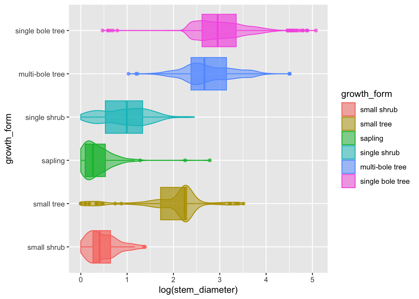
- The central line in each box corresponds to the median.
- The lower and upper hinges correspond to the first and third quartiles (the 25th and 75th percentiles) and define the Interquartile range (IQR).
- The whiskers are calculated from the IQR and identify points considered statistical outliers.
Again, we see the same information but this time we have a much more informative and compact plot.
We would still need a plot per variable though.
We could try and utilise facet_grid to combine a plot for each continuous variable stem_diameter and height into a single plot. However, there isn’t a variable in the data in the current form that could be used to facet on. The data is instead held across two separate columns, stem_diameter and height.
Pivoting data to longer
To take advantage of facet_wrap we need to pivot our data into a longer format using pivot_longer from package tidyr.
pivot_longer() “lengthens” data, increasing the number of rows and decreasing the number of columns. We use it to stack the values of stem_diameter and height into a column called value and store the original column names which define the variable each value relates to in a new column var. The values of growth_form are duplicated and stacked.
analysis_df %>%
tidyr::pivot_longer(
cols = c(stem_diameter, height),
names_to = "var",
values_to = "value"
)# A tibble: 23,252 × 3
growth_form var value
<fct> <chr> <dbl>
1 single bole tree stem_diameter 17.1
2 single bole tree height 15.2
3 single bole tree stem_diameter 13.7
4 single bole tree height 9.8
5 single bole tree stem_diameter 12.3
6 single bole tree height 7.7
7 single bole tree stem_diameter 12.1
8 single bole tree height 15.2
9 single bole tree stem_diameter 29.2
10 single bole tree height 16.7
# ℹ 23,242 more rowsNote that the number of rows is now twice the size of the original data because two columns have been stacked. Those columns have also now been removed.
With data in this format, we can use variable var to create a facet for each variable.
Figure 2: Data characteristics of our raw data
Let’s add the pivot as a step in our plotting pipeline and include faceting with facet_grid.
analysis_df %>%
tidyr::pivot_longer(
cols = c(stem_diameter, height),
names_to = "var",
values_to = "value"
) %>%
ggplot(aes(x = log(value), y = growth_form, colour = growth_form,
fill = growth_form)) +
geom_violin(alpha = 0.5, trim = T) +
geom_boxplot(alpha = 0.7, show.legend = FALSE) +
facet_grid(~var)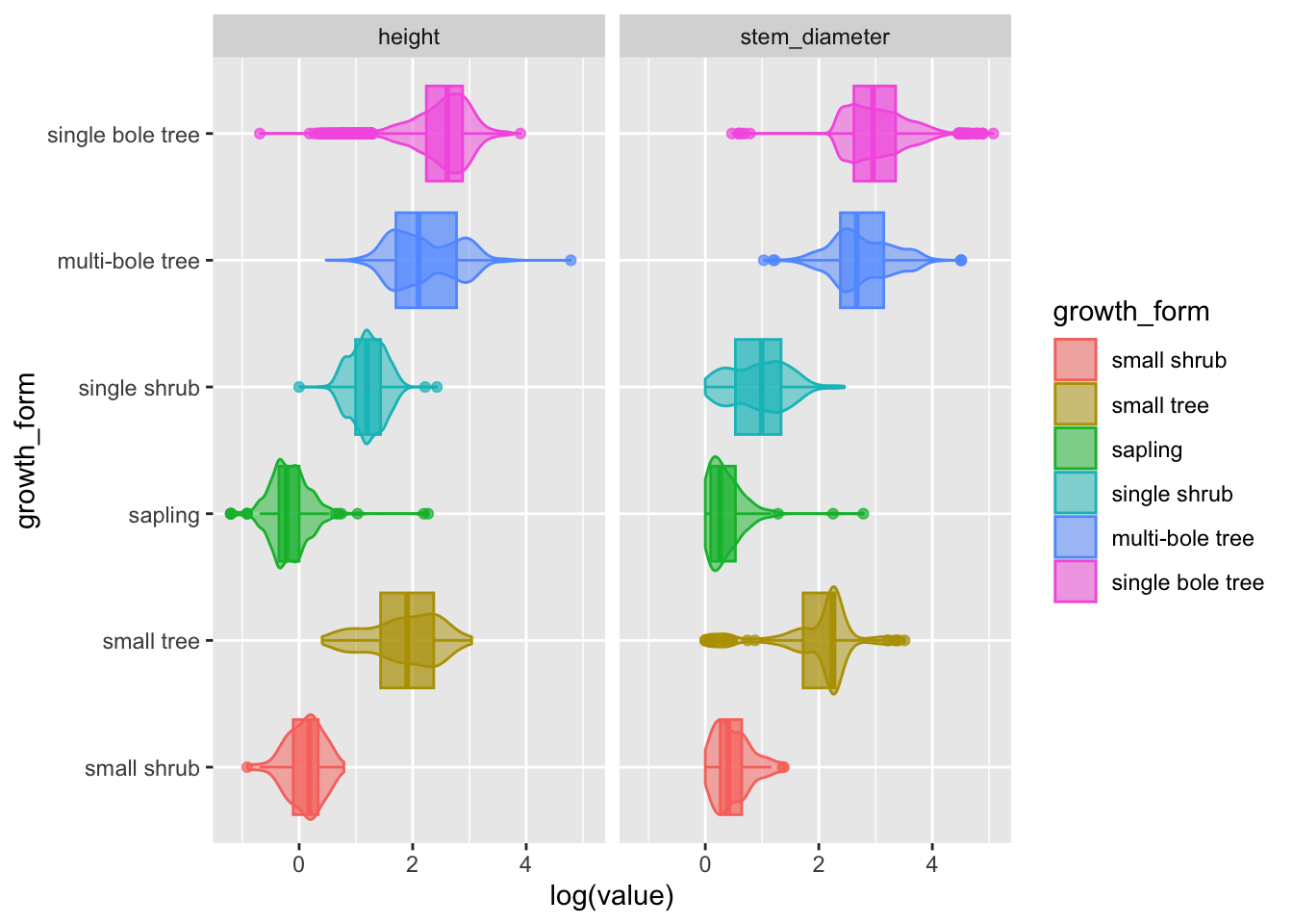
Hurray! Now we have a super informative plot, containing visual encodings of distributions and statistical summaries for both our continuous variables in one compact plot!
💾 Let’s keep this plot and move it to our analysis.R script as fig 1.
Analysis in practice: fitting and visualising a simple linear model
Now that we’ve explored our variables, it’s time to start looking at the statistical relationship between them.
Analysing the relationship between log(stem_diameter) and log(height)
First we might want to look at the overall relationship between our two continuous variables and we can start with fitting a simple linear regression model.
In R, we use lm to fit linear models. It can be used to carry out regression, single stratum analysis of variance and analysis of covariance.
Fitting a linear model
We specify our model through a formula log(stem_diameter) ~ log(height). This translates to log stem diameter as a function of height where stem_diameter is the response variable and height the predictor.
Call:
lm(formula = log(stem_diameter) ~ log(height), data = analysis_df)
Coefficients:
(Intercept) log(height)
0.5609 0.9439 By default lm prints a rather terse summary of the model.
An easy way to print nice and tidy outputs of most models in R is by using functions from package broom.
# A tibble: 1 × 12
r.squared adj.r.squared sigma statistic p.value df logLik AIC BIC
<dbl> <dbl> <dbl> <dbl> <dbl> <dbl> <dbl> <dbl> <dbl>
1 0.679 0.679 0.487 24613. 0 1 -8132. 16271. 16293.
# ℹ 3 more variables: deviance <dbl>, df.residual <int>, nobs <int>glance() accepts a model object and returns a tibble with exactly one row of model summaries. The summaries are typically goodness of fit measures, p-values for hypothesis tests on residuals, or model convergence information.
# A tibble: 2 × 5
term estimate std.error statistic p.value
<chr> <dbl> <dbl> <dbl> <dbl>
1 (Intercept) 0.561 0.0145 38.7 5.36e-308
2 log(height) 0.944 0.00602 157. 0 tidy() summarizes information about the components of a model. In the case of a linear model, components are the parameters associated with a regression i.e. the intercept and slope.
Visualising our overall model
To plot the relationship that the lm has fit, we plot a scatter plot using geom_point() and map log(height) to x (the predictor) and log(stem_diameter) to y (the response).
We can also add a line to our plot using geom_smooth(). This plots a smooth over the data by default but can use method lm to plot lines using a linear model.
analysis_df %>%
ggplot(aes(x = log(height), y = log(stem_diameter))) +
geom_point(alpha = 0.2) +
geom_smooth(method = "lm")`geom_smooth()` using formula = 'y ~ x'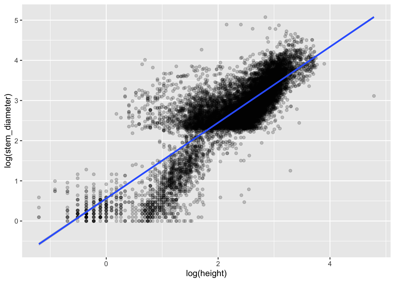
Changing the theme and adding custom axes labels
Let’s bring this closer to publication level by adding more formal custom axes labels with xlab() and ylab() and changing the theme to the built in theme theme_linedraw().
analysis_df %>%
ggplot(aes(x = log(height), y = log(stem_diameter))) +
geom_point(alpha = 0.2) +
geom_smooth(method = "lm") +
xlab("Log of height (m)") +
ylab("Log of stem diameter (cm)") +
theme_linedraw()`geom_smooth()` using formula = 'y ~ x'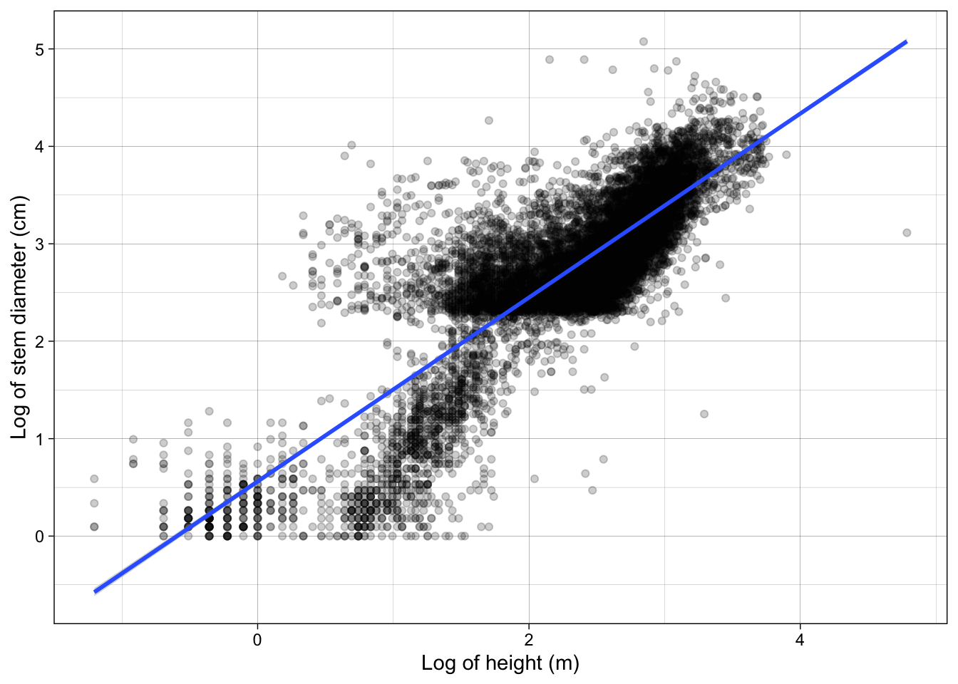
Including an interaction with growth_form
Inspecting the plot we can clearly see sub groups in our data. We already know that both our variables have very different distributions across growth_form. So let’s see if our model improves if we include growth_form in our model specification.
Growth form is a categorical variable so when we include it in our regression, lm will fit separate coefficients for our model at every level of the factor. To include it, we add it to the predictor side of our formula. If we include it as an additive effect through +, only the intercept will vary across factor levels. If we fit it as an interaction using * both the slope and intercept are allowed to vary.
We can again examine our model using broom
# A tibble: 1 × 12
r.squared adj.r.squared sigma statistic p.value df logLik AIC BIC
<dbl> <dbl> <dbl> <dbl> <dbl> <dbl> <dbl> <dbl> <dbl>
1 0.799 0.799 0.386 4195. 0 11 -5418. 10862. 10957.
# ℹ 3 more variables: deviance <dbl>, df.residual <int>, nobs <int>We can see that model coverage as indicated by r.squared is now higher and the p.value is still significant
# A tibble: 12 × 5
term estimate std.error statistic p.value
<chr> <dbl> <dbl> <dbl> <dbl>
1 (Intercept) 0.442 0.0479 9.23 3.16e- 20
2 log(height) 0.391 0.142 2.75 5.99e- 3
3 growth_formsmall tree -0.255 0.107 -2.38 1.73e- 2
4 growth_formsapling -0.0318 0.0545 -0.583 5.60e- 1
5 growth_formsingle shrub -0.945 0.0707 -13.4 1.96e- 40
6 growth_formmulti-bole tree 0.904 0.0618 14.6 4.14e- 48
7 growth_formsingle bole tree 1.12 0.0521 21.5 7.23e-101
8 log(height):growth_formsmall tree 0.561 0.151 3.73 1.93e- 4
9 log(height):growth_formsapling -0.0820 0.155 -0.531 5.96e- 1
10 log(height):growth_formsingle shrub 0.812 0.148 5.48 4.45e- 8
11 log(height):growth_formmulti-bole tree 0.245 0.143 1.71 8.68e- 2
12 log(height):growth_formsingle bole tr… 0.185 0.143 1.30 1.95e- 1We see the model coefficients for each growth form slope and interaction.
The first 2 row show the intercept and slope for the first level of growth_form ie small shrub which is considered the reference level.
The rest of the rows show the intercepts and slopes with respect to the values of the coefficients for small shrub so they represent differences from the reference level, level 1.
Visualising our model
To include the interaction with growth_form we apply a grouping to our scatter plot through aesthetic colour.
analysis_df %>%
ggplot(aes(x = log(height), y = log(stem_diameter), colour = growth_form)) +
geom_point(alpha = 0.1) +
geom_smooth(method = "lm") +
labs(
x = "Log of height (m)",
y = "Log of stem diameter (cm)",
colour = "Growth forms"
) +
theme_linedraw()`geom_smooth()` using formula = 'y ~ x'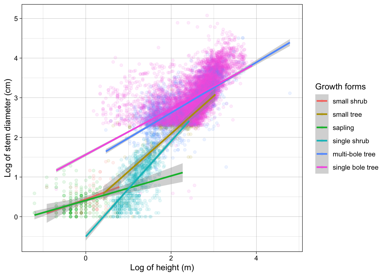
Let’s also use the labs() function this time to provide custom axes titles as well as add a custom title to our colour legend.
Excellent! We now have specified both models and visualised them! Our analysis is complete.
NOTE: the geom_smooth method of plotting model lines is not ideal and you will likely take more formal approaches to calculating and plotting confidence intervals. But for the purposes of of this workshop, we’ll stick with this.
Final analysis.R
💾 Lets add all our models and plots to our analysis.R script..
Your analysis.R script should now look like this.
analysis.R
## Setup ----
# Load libraries
library(dplyr)
library(ggplot2)
# Load data
individual <- readr::read_csv(
  here::here("data", "individual.csv")
) %>%
  select(stem_diameter, height, growth_form)
## Subset analysis data ----
analysis_df <- individual %>%
  filter(complete.cases(.), growth_form != "liana")
## Order growth form levels
gf_levels <- table(analysis_df$growth_form) %>%
  sort() %>%
  names()
analysis_df <- analysis_df %>%
  mutate(growth_form = factor(growth_form,
    levels = gf_levels
  ))
## Plots ----
## Figure 1: Bar plot of growth forms
analysis_df %>%
ggplot(aes(
y = growth_form, colour = growth_form,
fill = growth_form
)) +
geom_bar(alpha = 0.5, show.legend = FALSE)
## Figure 2: Violin plots of stem diameter and height across growth forms
analysis_df %>%
  tidyr::pivot_longer(
    cols = c(stem_diameter, height),
    names_to = "var",
    values_to = "value"
) %>%
ggplot(aes(
x = log(value), y = growth_form,
colour = growth_form, fill = growth_form
)) +
geom_violin(alpha = 0.5, trim = TRUE, show.legend = FALSE) +
geom_boxplot(alpha = 0.7, show.legend = FALSE) +
facet_grid(~var) +
theme_linedraw()
## Fit overall linear model ----
lm_overall <- lm(
log(stem_diameter) ~ log(height),
analysis_df
)
lm_overall %>%
  broom::glance()
lm_overall %>%
  broom::tidy()
## Plot overall linear model
analysis_df %>%
  ggplot(aes(x = log(height), y = log(stem_diameter))) +
  geom_point(alpha = 0.2) +
geom_smooth(method = "lm") +
xlab("Log of height (m)") +
ylab("Log of stem diameter (cm)") +
theme_linedraw()
## Fit linear model with growth form interaction ----
lm_growth <- lm(
log(stem_diameter) ~ log(height) * growth_form,
analysis_df
)
lm_growth %>%
  broom::glance()
lm_growth %>%
  broom::tidy()
## Plot linear model with growth form interaction
analysis_df %>%
  ggplot(aes(x = log(height), y = log(stem_diameter), colour = growth_form)) +
  geom_point(alpha = 0.1) +
  geom_smooth(method = "lm") +
  labs(
    x = "Log of height (m)",
    y = "Log of stem diameter (cm)",
    colour = "Growth forms"
  ) +
  theme_linedraw()